# Designing the UI with Widgets
- As you know by now, in Flutter (almost) everything is a widget!
- Before writing your first real app, there are some basic widgets you should know
- We'll introduce most of them in this section: the Container, Text, Row and Column, Image, and ElevatedButton widgets
- Together with Scaffold and AppBar, these widgets give you the basic tools to start working with Flutter
WIDGET OF THE WEEK
There are many more widgets than we can cover in this course. On the Flutter YouTube channel, a widget is placed in the spotlight every week. It is highly recommended taking a look there, also for getting ideas of what widgets to use in your project.
# Building a Profile app
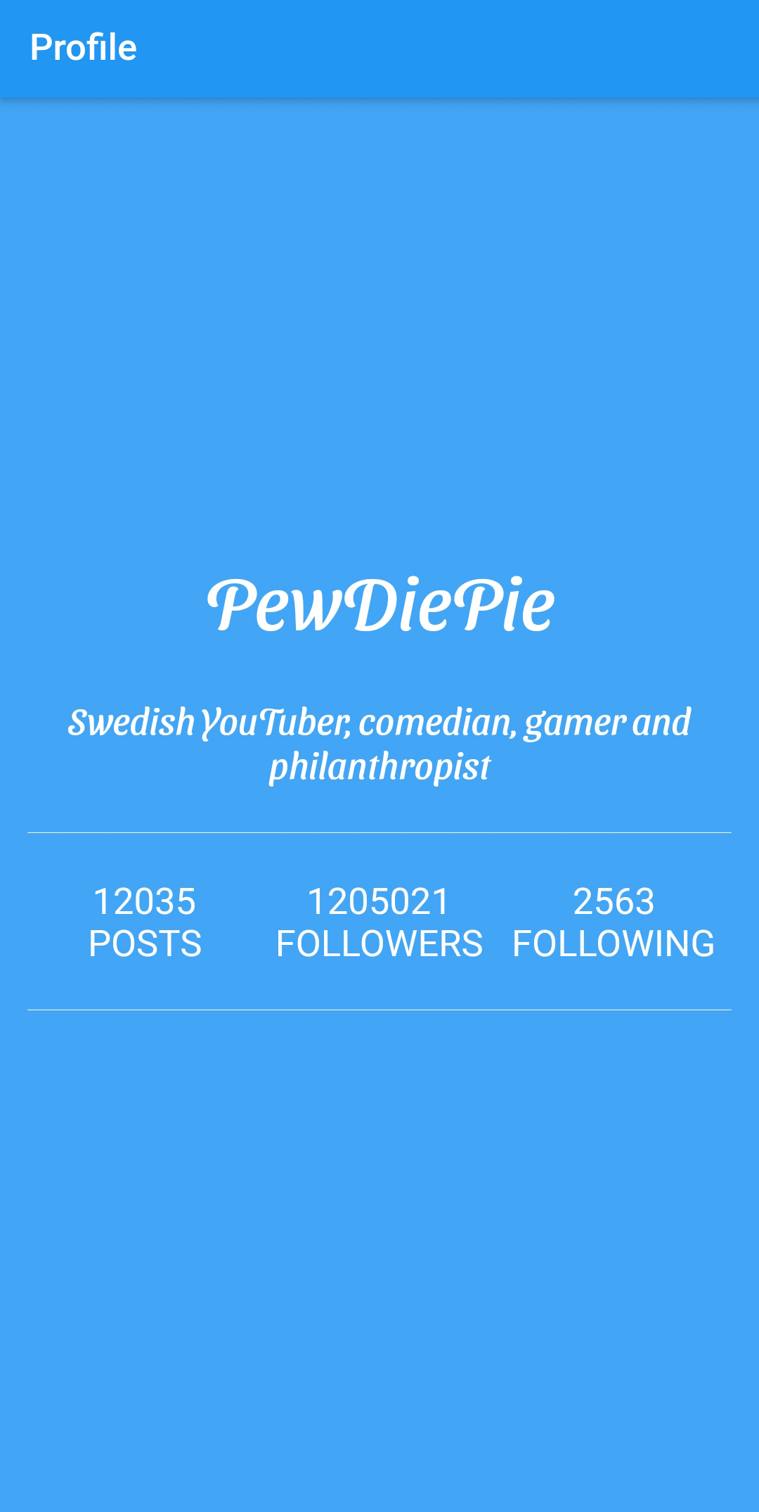
- To illustrate the use of the widgets, we will create a very simple, but beautiful app with one page: a profile page
- To make it a little bit more interesting, we will pretend it is the profile page of the very famous Swedish YouTuber PewDiePie
# Create the app
- Open VS Code, choose View | Command Palette. Search for
flutterand choose Flutter: New Project

- Choose the Application template
- Save the app in your Flutter source folder
- Enter the name of the project
profile_app

- When the app is created, delete the testfile
widget_test.dartin thetestfolder
# Material Design
- As in the first example, we will prettify our user interface by using Material Design
- Replace the content of
main.dartwith the following code:
import 'package:flutter/material.dart';
import 'package:profile_app/pages/home.dart';
void main() {
runApp(const ProfileApp());
}
class ProfileApp extends StatelessWidget {
const ProfileApp({Key? key}) : super(key: key);
// This widget is the root of your application.
Widget build(BuildContext context) {
return MaterialApp(
debugShowCheckedModeBanner: false,
title: 'Profile',
theme: ThemeData(
primarySwatch: Colors.blue,
),
home: const HomePage(),
);
}
}
2
3
4
5
6
7
8
9
10
11
12
13
14
15
16
17
18
19
20
21
22
23
| code | description |
|---|---|
import 'package:flutter/material.dart'; | this package contains all Flutter widgets implementing Material Design |
import 'package:profile_app/pages/home.dart'; | import the file that contains the implementation of our page (we will create this file in a moment) |
main | entry point of a Flutter application |
runApp | will run our Profile app |
class ProfileApp ... | our app is a StatelessWidget |
MaterialApp() | defines that the app will use material design |
debugShowCheckedModeBanner | remove that ugly debug banner |
theme | we will use a blue theme (for the banner, buttons, ...) |
home: HomePage() | property to define the widget for the default route of the app, this will be the first (and only) page to show when the App starts |
TIP
Always use meaningful names for your apps and use the suffix App.
# Create a very simple page
- To organize your code a little bit, create a folder
pagesin thelibfolder. Thepagesfolder will contain the different pages of our app. In this case, it will be just one page. - In the
pagesfolder, create a new filehome.dart - Paste the following code
import 'package:flutter/material.dart';
class HomePage extends StatelessWidget {
const HomePage({Key? key}) : super(key: key);
Widget build(BuildContext context) {
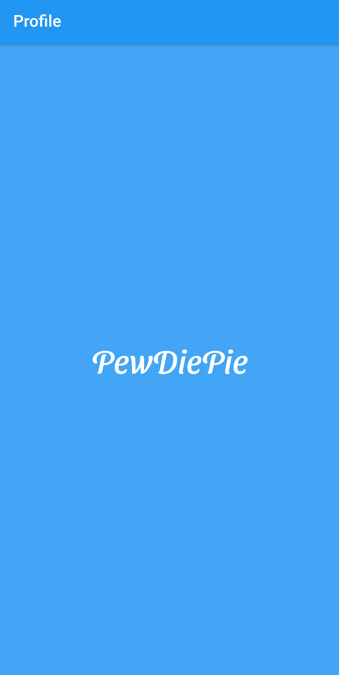
return Scaffold(
appBar: AppBar(
title: const Text("Profile"),
),
body: Container(
alignment: Alignment.center,
color: Colors.blue[400],
child: const Text("PewDiePie"),
),
);
}
}
2
3
4
5
6
7
8
9
10
11
12
13
14
15
16
17
18
19
| code | description |
|---|---|
Scaffold() | class that implements the basic material design visual layout structure |
appBar | property from Scaffold class to define an application bar |
AppBar() | class to implement the application bar |
title | property from AppBar class for the title of the application bar |
body | property from Scaffold class to to define the primary content of this scaffold |
TIP
Always use meaningful names for your pages and use the suffix Page.
# Using Containers
- Containers contain other widgets, you could think of a container as a div element.
| code | description |
|---|---|
alignment | alignment of the widgets of content of the container |
color | color of the container |
child | the container contains one child, a text widget with the text PewDiePie |
- Try to change the alignment to
Alignment.bottomRight,Alignment.centerLeft, ... and see what happens. At the end chooseAlignment.center. - We can also specify a width and height for our container and place it in the center of the page like this
class HomePage extends StatelessWidget {
const HomePage({Key? key}) : super(key: key);
Widget build(BuildContext context) {
return Scaffold(
appBar: AppBar(
title: const Text("Profile"),
),
body: Center(
child: Container(
alignment: Alignment.center,
width: 190.0,
height: 250.0,
color: Colors.blue[400],
child: const Text("PewDiePie"),
),
),
);
}
}
2
3
4
5
6
7
8
9
10
11
12
13
14
15
16
17
18
19
20
21
- But the width and height doesn't improve our UI, so comment them out.
          //width: 190.0,
          //height: 250.0,
2
# Margin and padding
- Margin is the distance between a widget and the other widgets on the screen.
- Padding is the distance between the content of a widget and its borders.
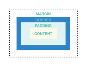
- You can use the
EdgeInsets.allto create a margin or padding on all four sides of a box, top, right, bottom, and left. - Use the
EdgeInsets.onlyif you want to specify the side you want to create the margin or padding, i.e.EdgeInsets.only(left: 15.0) - Try the code below and see what happens
      body: Center(
        child: Container(
          alignment: Alignment.center,
          // width: 190.0,
          // height: 250.0,
          margin: const EdgeInsets.all(50.0),
          color: Colors.blue[400],
          child: const Text("PewDiePie"),
        ),
      ),
2
3
4
5
6
7
8
9
10
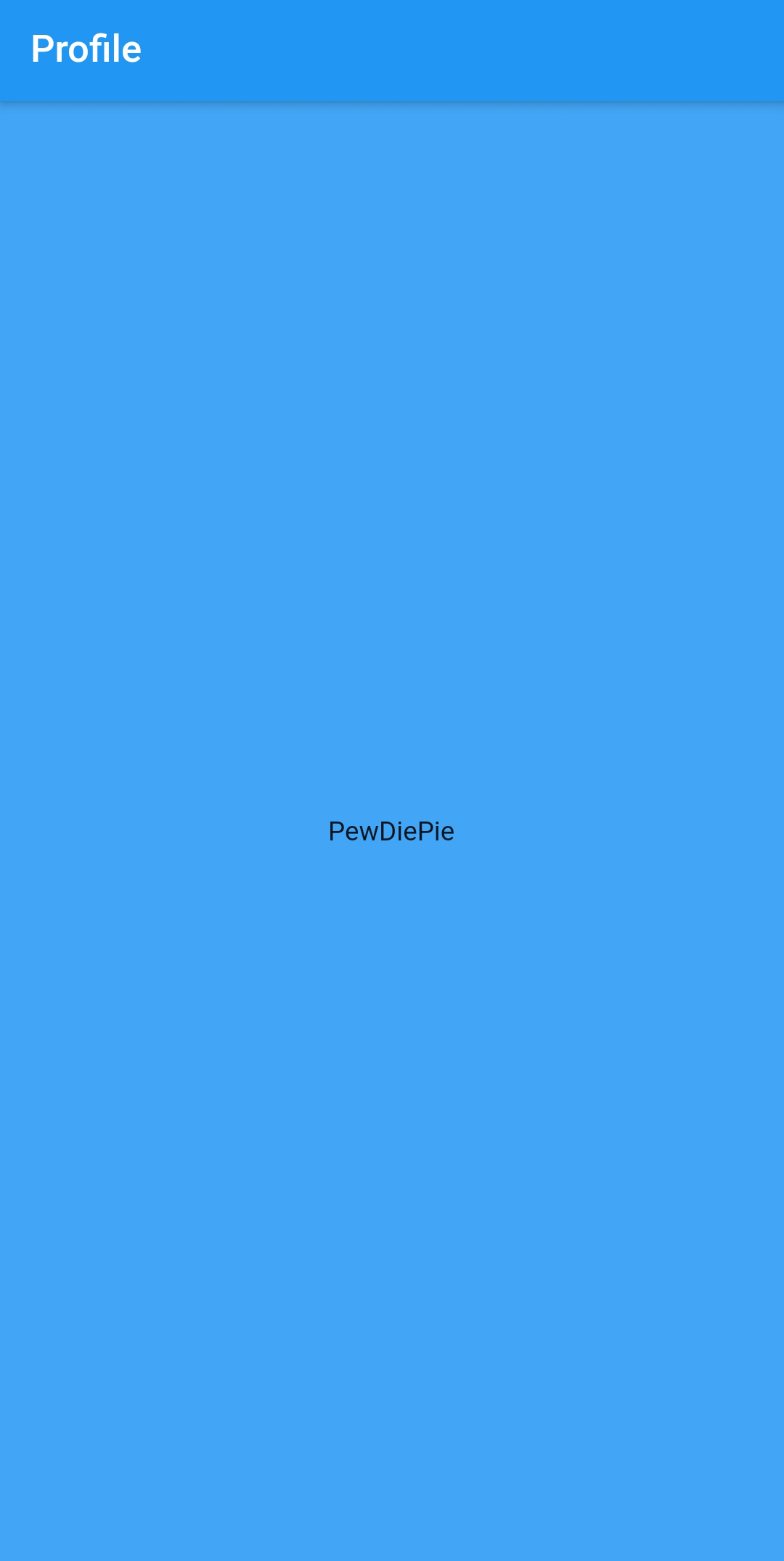
- Mmm, a little bit disappointing. Let's remove the margin, so comment it out and we'll try using padding instead
      body: Center(
        child: Container(
          padding: const EdgeInsets.all(15.0),
          alignment: Alignment.center,
          // width: 190.0,
          // height: 250.0,
          // margin: const EdgeInsets.all(50.0),
          color: Colors.blue[400],
          child: const Text("PewDiePie"),
        ),
      ),
2
3
4
5
6
7
8
9
10
11
- Your app should look like this now. Nothing to be proud off, but we will add some cool UI widgets right away
# Add Style to Text
# Downloading a font
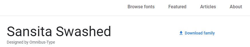
- First let's add a nice font to our project.
- Go to Google fonts
- Click on the
Sansita Swashedfont and download the font by clicking Download family
- Create a folder
fontsin your project folder and copy thettf-files (from thestaticsubfolder) into it
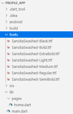
- Now import the font into your project by modifying the file
pubspec.yaml
  fonts:
    - family: SansitaSwashed
      fonts:
        - asset: fonts/SansitaSwashed-Regular.ttf
2
3
4
YAML = Error sensitive
- As you know an error is easily made in a
.yamlfile (rememberHomestead.yaml) - When you add the fonts section, you have to make sure that it is indented by just 2 spaces
TIP
pubspec.yaml is a file that contains information about our project metadata and dependencies.
We can use it to declare the fonts we are using, as well as other assets in our projects.
- Modify your code
          child: const Text(
            "PewDiePie",
            style: TextStyle(
              fontSize: 40.0,
              decoration: TextDecoration.none,
              fontFamily: 'SansitaSwashed',
              fontWeight: FontWeight.normal,
              color: Colors.white,
            ),
          ),
2
3
4
5
6
7
8
9
10
| code | description |
|---|---|
style | to add some style to a Text widget, we'll use the style property that takes a TextStyle object |
fontSize | fontSize property, which requires a double value |
decoration | for TextDecoration we choose the none value. We could also choose overline, underline, or lineThrough |
fontFamily | family name of the imported font in pubspec.yaml |
fontWeight | we could also choose bold |
color | textcolor |
- This is already a start
Restart application
- It's possible that your font doesn't change (even after restarting the debugger)
- In this case just completely stop the application and start debugging again in VS Code
# Positioning Widgets with Rows and Columns
- The
Rowlayout is a list of child widgets placed horizontally. TheColumnis a list of child widgets placed vertically.

- Row contains an array of widgets so it does not have a
childproperty, but thechildrenproperty that contains the array. Column also has achildrenproperty that contains the array with children widgets. - We 'll modify the code and, using a
Columnwidget, we'll show two Text Widgets, one above the other - The HomePage class now looks like this
class HomePage extends StatelessWidget {
const HomePage({Key? key}) : super(key: key);
Widget build(BuildContext context) {
return Scaffold(
appBar: AppBar(
title: const Text("Profile"),
),
body: Container(
padding: const EdgeInsets.all(15.0),
alignment: Alignment.center,
color: Colors.blue[400],
child: const Column(
mainAxisAlignment: MainAxisAlignment.center,
children: <Widget>[
Text(
"PewDiePie",
style: TextStyle(
fontSize: 40.0,
decoration: TextDecoration.none,
fontFamily: 'SansitaSwashed',
fontWeight: FontWeight.normal,
color: Colors.white),
),
SizedBox(height: 30),
Text(
"Swedish YouTuber, comedian, gamer and philanthropist",
style: TextStyle(
fontSize: 20.0,
decoration: TextDecoration.none,
fontFamily: 'SansitaSwashed',
fontWeight: FontWeight.normal,
color: Colors.white),
textAlign: TextAlign.center,
),
// Row comes here
],
),
),
);
}
}
2
3
4
5
6
7
8
9
10
11
12
13
14
15
16
17
18
19
20
21
22
23
24
25
26
27
28
29
30
31
32
33
34
35
36
37
38
39
40
41
42
43
REMARK
- We removed the Center widget, since it does not work with Columns. To center a Column, we used
MainAxisAlignment.centerinstead. - We used a
SizedBoxof height 30.0 to put some extra space between the two Text widgets. - We also removed the comments.
- Of course,
Rowwidgets andColumnwidgets can be nested. - Below the last
Textwidget (within thechildrenarray ofColumn), we'll put aRowwith threeTextwidgets - We have changed the position of some
constkeywords in the code above.
            Row(
              children: <Widget>[
                Text(
                  "12035 posts",
                  textAlign: TextAlign.center,
                ),
                Text(
                  "1205021 followers",
                  textAlign: TextAlign.center,
                ),
                Text(
                  "2563 following",
                  textAlign: TextAlign.center,
                ),
              ],
            ),
2
3
4
5
6
7
8
9
10
11
12
13
14
15
16
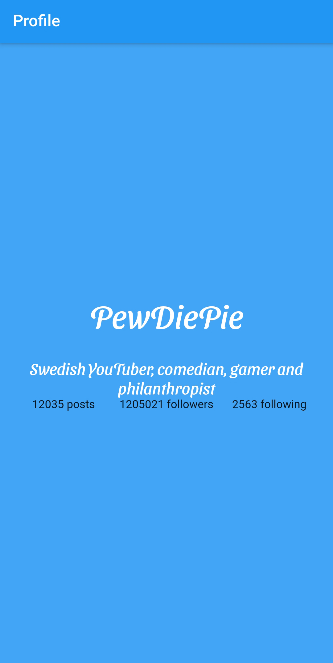
# Filling space with Expanded
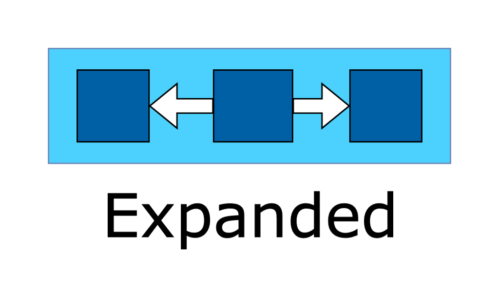
- As you can see, the total space of the Row isn't used by the three Text children. We can easily solve that by using an
Expanded, a widget that expands a child of a row or a column. The child will expand to fill the available space horizontally for a row or vertically for a column.
- Replace the Row with the code below
            Row(
              children: <Widget>[
                Expanded(
                  child: Text(
                    "12035 posts",
                    textAlign: TextAlign.center,
                  ),
                ),
                Expanded(
                  child: Text(
                    "1205021 followers",
                    textAlign: TextAlign.center,
                  ),
                ),
                Expanded(
                  child: Text(
                    "2563 following",
                    textAlign: TextAlign.center,
                  ),
                ),
              ],
            ),
2
3
4
5
6
7
8
9
10
11
12
13
14
15
16
17
18
19
20
21
22
- You can see the difference below
# Divider
- Let's put a horizontal line above and below the row. This can be done using a
Dividerwidget.
Divider(height: 50.0, color: Colors.white),
# Create a custom widget
- As you might have guessed by now, it will be an impossible task to design the UI of the whole page in one build method. We have still a lot of work to do and our dart code already looks quite messy. We can solve this by splitting up our UI in small custom widgets.
- Create a new folder
widgetsin thelibfolder. - Inside the
widgetsfolder, create a new filenumberlabel.dart. This widget will contain a number and a label. - Paste the following code
import 'package:flutter/material.dart';
class NumberLabelWidget extends StatelessWidget {
final String text;
final int count;
const NumberLabelWidget(
{Key? key, required this.text, required this.count})
: super(key: key);
Widget build(BuildContext context) {
return Expanded(
child: Column(
children: <Widget>[
Text(
count.toString(),
style: const TextStyle(
fontSize: 20.0,
decoration: TextDecoration.none,
color: Colors.white,
fontWeight: FontWeight.normal,
),
),
Text(
text.toUpperCase(),
style: const TextStyle(
fontSize: 20.0,
decoration: TextDecoration.none,
color: Colors.white,
fontWeight: FontWeight.normal,
),
),
],
),
);
}
}
2
3
4
5
6
7
8
9
10
11
12
13
14
15
16
17
18
19
20
21
22
23
24
25
26
27
28
29
30
31
32
33
34
35
36
37
38
| code | description |
|---|---|
class NumberLabelWidget extends StatelessWidget | our custom widget is a StatelessWidget |
final String text; final int count; | the widget has two properties text and count |
const NumberLabelWidget({Key? key, required this.text, required this.count}): super(key: key); | the constructor of the widget saves the parameters (text and count) in the properties. Dart does this automatically. You don't have to write this code yourself. Both parameters are required by the way. As always we'll use the optional key parameter, when calling the constructor of the super class. |
Widget build(BuildContext context) { | override the build method to render the widget |
Column | we use a Column widget to position the count widget above the text widget |
TIP
Always use meaningful names for your widgets and use the suffix Widget.
- Now we can use our custom widget in our
HomePage. - First import the dart-file containing the widget.
- Then replace the Row with the Text widgets by the Row with the custom NumberLabelWidget's
import 'package:flutter/material.dart';
import 'package:profile_app/widgets/numberlabel.dart';
...
            Row(children: <Widget>[
              NumberLabelWidget(
                count: 12035,
                text: "posts",
              ),
              NumberLabelWidget(
                count: 1205021,
                text: "followers",
              ),
              NumberLabelWidget(
                count: 2563,
                text: "following",
              ),
            ]),
2
3
4
5
6
7
8
9
10
11
12
13
14
15
16
17
- Now we are getting somewhere
# Adding Images from Assets
- There are several sources you can choose from to display images in your Flutter app.
- We will load images from assets. Assets are resources you add to your project.
- Create a folder
assetsin the root folder of you app. - Download the avatar of PewDiePie and copy it into the
assetsfolder. - Open the
pubspec.yamlfile. Here, you need to create a section for your images.
flutter:

  # The following line ensures that the Material Icons font is
  # included with your application, so that you can use the icons in
  # the material Icons class.
  uses-material-design: true

  # To add assets to your application, add an assets section, like this:
  assets:
    - assets/pewdiepie.png
2
3
4
5
6
7
8
9
10
- As good developers, we like to build our app in a modular way, so we'll create a custom widget once again to show the PewDiePie avatar.
- Inside the
widgetsfolder, create a new filecircleimage.dart. This widget will be a rounded image. - Paste the following code
import 'package:flutter/material.dart';
class CircleImageWidget extends StatelessWidget {
final String imageName;
const CircleImageWidget(
{Key? key, required this.imageName})
: super(key: key);
Widget build(BuildContext context) {
AssetImage avatarAsset = AssetImage(imageName);
return Image(
image: avatarAsset,
width: 100.0,
);
}
}
2
3
4
5
6
7
8
9
10
11
12
13
14
15
16
17
18
| code | description |
|---|---|
class CircleImageWidget extends StatelessWidget | our custom widget is a StatelessWidget |
final String imageName; | the widget has only one property imageName, the name of the image to use as avatar |
AssetImage avatarAsset = AssetImage(imageName); | this will create an asset from the imageName we specify in the constructor |
return Image(image: avatarAsset); | create the image widget and in the constructor, we'll specify an image property that will be our avatar asset |
- Now we can use our custom widget in our
HomePage. - First import the dart-file containing the widget.
- Then insert the
CircleImageWidgetas the first widget in the children property of the Column widget. We'll put some extra space between the avatar and PewDiePie's name
import 'package:profile_app/widgets/circleimage.dart';
...
            CircleImageWidget(
              imageName: "assets/pewdiepie.png",
            ),
            SizedBox(height: 30),
2
3
4
5
6
- Restart your app (since you added an asset file), you should see the PewDiePie avatar
# CircleAvatar
- Not bad, but normally, avatars are shown with rounded borders. Modify the build method of your custom widget
Widget build(BuildContext context) {
AssetImage avatarAsset = AssetImage(imageName);
return CircleAvatar(
radius: 100.0,
backgroundImage: avatarAsset,
);
}
2
3
4
5
6
7
8
- That looks more like it!
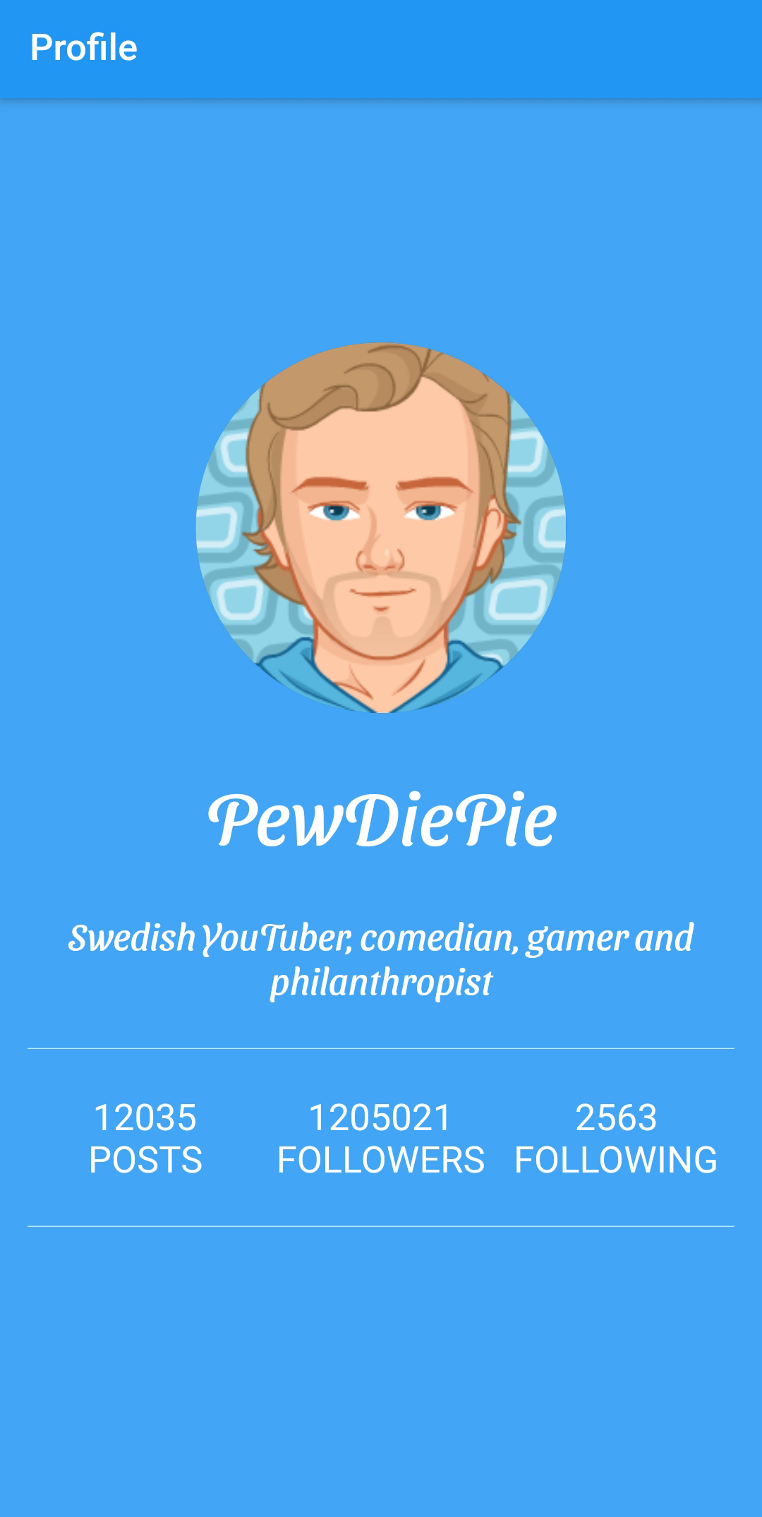
# Giving Feedback
# ElevatedButton
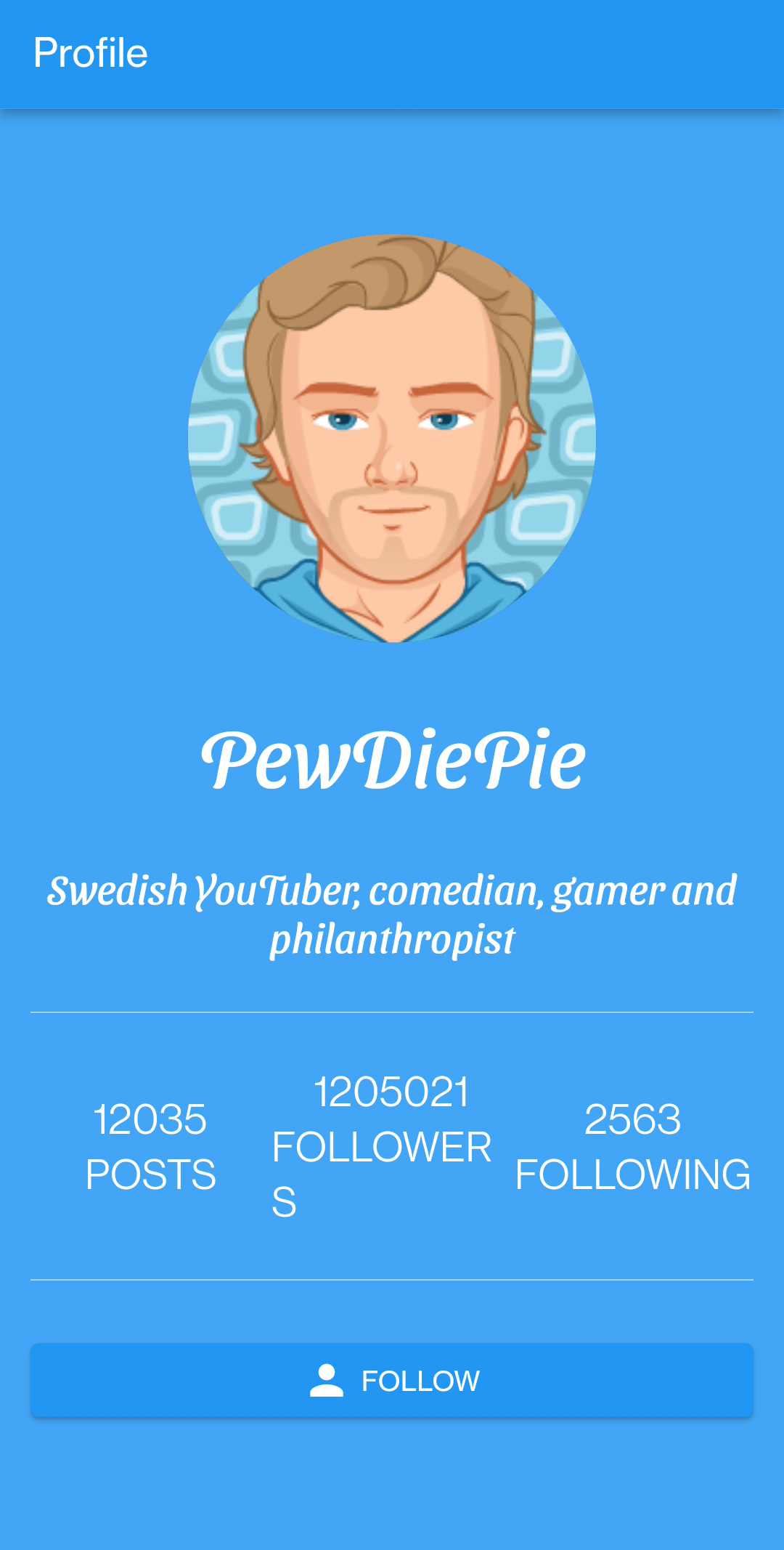
- We will create a button at the bottom. When our users press the button, we want to show a message to give feedback.
- We will use an ElevatedButton, a button with an elevation, but there's also a flat TextButton. You can try this one yourself.
- Let's make our final custom widget.
- Inside the
widgetsfolder, create a new fileiconbutton.dart. Our button will also contain an icon. - Paste the following code
import 'package:flutter/material.dart';
typedef MyCallback = void Function(String text);
class IconButtonWidget extends StatelessWidget {
final String text;
final IconData icon;
final MyCallback onButtonPressed;
const IconButtonWidget(
{Key? key, required this.text, required this.icon, required this.onButtonPressed})
: super(key: key);
Widget build(BuildContext context) {
return ElevatedButton(
child: Row(
mainAxisAlignment: MainAxisAlignment.center,
children: <Widget>[
Icon(icon),
const SizedBox(
width: 5,
),
Text(text.toUpperCase())
],
),
onPressed: () {
onButtonPressed(text);
},
);
}
}
2
3
4
5
6
7
8
9
10
11
12
13
14
15
16
17
18
19
20
21
22
23
24
25
26
27
28
29
30
31
32
| code | description |
|---|---|
typedef MyCallback = void Function(String text); | when we press the button in our widget, we want to activate a callback function in our HomePage. This callback function will be a void with one parameter, namely the text on the button that has been pressed. |
final String text; | the widget has a property text, the text that is displayed on the button |
final IconData icon; | the widget has a property icon, the icon shown on the button |
final MyCallback onButtonPressed; | we will pass the callback-function in the onButtonPressed parameter |
return ElevatedButton( | create the ElevatedButton |
child: Row( | we will use the Rowwidget to show the icon next to the text |
- Now we can use our custom widget in our
HomePage. - First import the dart-file containing the widget.
- Then insert the
IconButtonWidgetas the last widget in the children property of the Column widget
import 'package:profile_app/widgets/iconbutton.dart';
...
            IconButtonWidget(
                icon: Icons.person,
                text: "follow",
                onButtonPressed: (text) {
                }),
2
3
4
5
6
7
- Because the callback function onButtonPressed can't be in a const widget, we have to bring down the const one level (from Column). You can do this yourself.
# AlertDialog
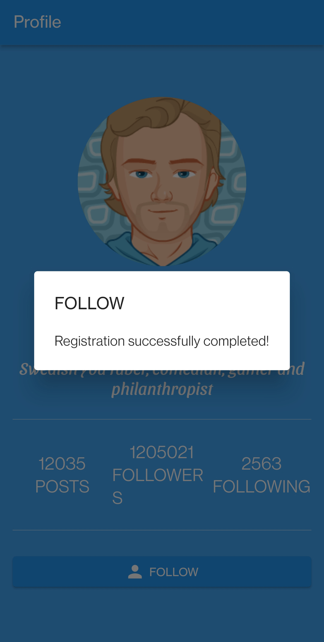
- To finish our Profile app, we want to give feedback when the user pressed the button.
- Paste the code below in the
HomePageclass
  void _follow(String text, BuildContext context) {
    var alert = AlertDialog(
      title: Text(text.toUpperCase()),
      content: const Text("Registration successfully completed!"),
    );
    showDialog(context: context, builder: (BuildContext context) => alert);
  }
2
3
4
5
6
7
| code | description |
|---|---|
var alert = AlertDialog( | create a new AlertDialog window with a title and a content |
showDialog(context: context, builder: (BuildContext context) => alert); | Call the showDialog method passing the context and the builder that will return our alert that we have just set up. |
- Finally pass the _follow function as the callback function of the custom widget.
- The complete code of our HomePage is
import 'package:flutter/material.dart';
import 'package:profile_app/widgets/numberlabel.dart';
import 'package:profile_app/widgets/circleimage.dart';
import 'package:profile_app/widgets/iconbutton.dart';
class HomePage extends StatelessWidget {
const HomePage({Key? key}) : super(key: key);
Widget build(BuildContext context) {
return Scaffold(
appBar: AppBar(
title: const Text("Profile"),
),
body: Container(
padding: const EdgeInsets.all(15.0),
alignment: Alignment.center,
color: Colors.blue[400],
child: Column(
mainAxisAlignment: MainAxisAlignment.center,
children: <Widget>[
const CircleImageWidget(
imageName: "assets/pewdiepie.png",
),
const SizedBox(height: 30),
const Text(
"PewDiePie",
style: TextStyle(
fontSize: 40.0,
decoration: TextDecoration.none,
fontFamily: 'SansitaSwashed',
fontWeight: FontWeight.normal,
color: Colors.white),
),
const SizedBox(height: 30),
const Text(
"Swedish YouTuber, comedian, gamer and philanthropist",
style: TextStyle(
fontSize: 20.0,
decoration: TextDecoration.none,
fontFamily: 'SansitaSwashed',
fontWeight: FontWeight.normal,
color: Colors.white),
textAlign: TextAlign.center,
),
const Divider(height: 50.0, color: Colors.white),
const Row(children: <Widget>[
NumberLabelWidget(
count: 12035,
text: "posts",
),
NumberLabelWidget(
count: 1205021,
text: "followers",
),
NumberLabelWidget(
count: 2563,
text: "following",
),
]),
const Divider(height: 50.0, color: Colors.white),
IconButtonWidget(
icon: Icons.person,
text: "follow",
onButtonPressed: (text) {
_follow(text, context);
}),
],
),
),
);
}
void _follow(String text, BuildContext context) {
var alert = AlertDialog(
title: Text(text.toUpperCase()),
content: const Text("Registration successfully completed!"),
);
showDialog(context: context, builder: (BuildContext context) => alert);
}
}
2
3
4
5
6
7
8
9
10
11
12
13
14
15
16
17
18
19
20
21
22
23
24
25
26
27
28
29
30
31
32
33
34
35
36
37
38
39
40
41
42
43
44
45
46
47
48
49
50
51
52
53
54
55
56
57
58
59
60
61
62
63
64
65
66
67
68
69
70
71
72
73
74
75
76
77
78
79
80
81
- And our final Profile page looks like this
IMPORTANT
Maybe the most important lesson, you should have learned in this section, is - for modularity, better readability, simplicity and ease of maintenance - to always split your page into seperate custom widgets.
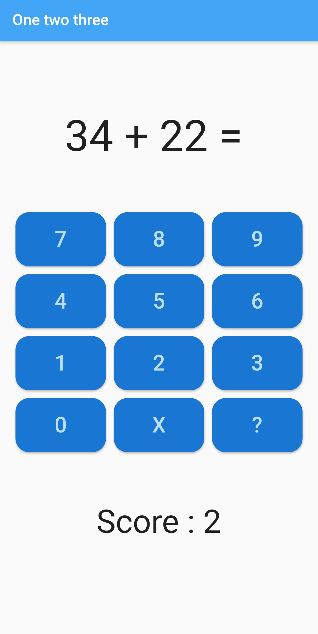
# Exercise - One two three (part 1)
- In this exercise you will develop an app with which primary school children can practice their arithmetic skills. In the first part, you will design the UI. In the second part you will program the code. The app looks like this
# Create the app
- Create a new flutter application with name
one_two_three - Create the following directories in the
libfolder to organize your code:pagesandwidgets - Delete
widget_test.dartin thetestfolder - In
main.dartopen aMaterialAppwith the right colors. The name of the app isOneTwoThreeApp. Remove that ugly debug banner. In the home property call the page widget for the default route of the app:HomePage
# Design the UI of the HomePage
- Create a new file
home.dartin thepagesfolder - Create
HomePage, a stateless widget (for now at least). Design the UI of the page. Use aScaffoldwidget withAppBar. - Also make use of the
ColumnandRowwidgets. - Create a custom widget for the buttons, namely
NumberButton. This custom widget has anumberproperty and aonButtonPressedcallback function with one parameter, thenumberof the button being pressed.
# Download a font
- Download a nice font from Google fonts and use it in your app.